Creating Engaging Bar Charts: A Comprehensive Guide
Written on
Chapter 1: Introduction to Bar Charts
Bar charts serve as an effective tool for visually representing frequencies of various characteristics, whether they're absolute or relative. These charts are commonly used in dashboards and reports, but how can we ensure they are designed for clarity and ease of interpretation? Here are three essential tips that can help you create visually appealing and informative bar charts. Notably, these tips are also applicable to other types of charts.
Let’s Get Started
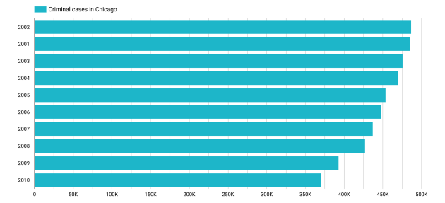
For this guide, I utilized the free Google Data Studio and accessed the Chicago Crime Data public dataset via BigQuery. You are encouraged to replicate this process if you're interested. After selecting the data source, I created an unformatted bar chart, merely assigning "date" as the dimension and "number of cases" as the metric. The resulting chart is depicted below.
Step 1: Ensure Data Interpretation is Straightforward
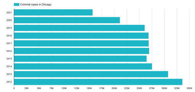
It's crucial for the data to convey its own narrative. While sorting by the number of cases might seem logical, organizing by year provides a clearer insight into trends, such as the decline in crime over recent years.
Step 2: Simplify Numeric Understanding
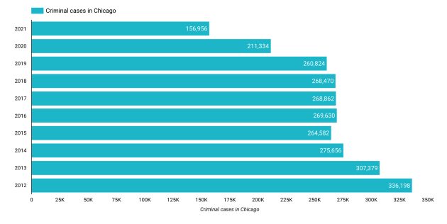
Avoid making your audience struggle to interpret the numbers; instead, display the values directly on each bar. This practice minimizes potential misunderstandings and allows for immediate clarity.

Step 3: Remove Unnecessary Elements
With the numbers on display, consider eliminating the background grid. A cleaner presentation can enhance visual appeal and focus attention on the data itself.
Summary
In my experience, these three design strategies greatly enhance the effectiveness of bar charts. They promote a clear structure and facilitate understanding, reducing the potential for misinterpretation. The initial step—grasping the underlying data—is perhaps the most critical and challenging. Only once you understand the data can you arrange the bars meaningfully. The rest becomes a matter of practice. Personally, I prefer using blue for the bars, though feel free to choose a color that best meets your needs.
If this topic interests you, consider exploring the following articles:
- The Don’ts of Dashboards: What are some Antipatterns in Business Intelligence and Designing Dashboards?
Sources and Further Readings
[1] Google, Data Studio (2021)
[2] Google Cloud Platform, Marketplace (2021)
Chapter 2: Enhancing Bar Charts with Visualization Techniques
The first video titled "Create Awesome Bar Charts | Best Visualization Practices for Charts" provides valuable insights into effective bar chart design techniques.
The second video, "Build Impressive Charts: It's NOT your usual Bar Chart (Infographics in Excel)," presents innovative approaches to creating engaging charts beyond traditional bar formats.